Measuring Data Jitter Using RCR

Background
In our recent Malware of the Day post, we explored Command and Control (C2) traffic generated by Merlin, an open-source C2 framework created by Ne0nd0g. One of the standout features we examined is what Merlin calls “padding,” a technique designed to “jitter the payload.”
Payload jitter is similar to delay jitter, but instead of varying the timing between agent and server communications, it alters the size of the payload. Specifically, it involves appending a random amount of data—within a predefined range—to each message. The idea is to break away from predictable payload size patterns, making the traffic appear more natural and reducing the likelihood of detection by security systems.
To illustrate, consider a typical agent-to-server check-in (or “heartbeat”) message that is 1586 bytes in size. If one applies Merlin’s default padding of 4096 bytes, the message size will now range between 1586 bytes and 5682 bytes, as a random amount of data (between 0 and 4096 bytes) is added to each transmission. If you were to visualize this in a tool like AC-Hunter, the payload size histogram would no longer show a tight, predictable distribution. Instead, you’d see a spread of values between 1586 and 5682 bytes, reflecting the variability introduced by payload jitter.
It was of course precisely this unusual pattern that first caught our attention during our investigation. The irregular payload sizes stood out, prompting us to dig deeper. This initial observation led us to uncover multiple layers of evidence, ultimately confirming that a compromise had indeed occurred.
Post-Incident Analysis
The conclusion of any discovered compromise offers a valuable opportunity—not just to reflect on the incident to check some boxes, but to reduce the likelihood of similar incidents occurring in the future. After all, if we don’t learn from our mistakes, we’re bound to repeat them.
When a novel behavior is involved, such as payload jitter in this case, it’s worth applying extra scrutiny. How did this new tactic evade our defenses? And how can we adapt to counter it?
Think of it like an immune system encountering a virus for the first time. By analyzing the virus’s genetic sequence, the immune system “learns” to produce antibodies that prevent future infections. Similarly, by dissecting the “genome” of a compromise—its unique patterns and behaviors—we can better recognize and respond to similar threats in the future, improving our ability to prevent or detect compromises more efficiently.
The Data Jitter “Genome”
So, what might these unique “patterns and behaviors” look like when it comes to payload jitter? What caught our attention during the investigation was the unusual shape of the packet size histogram produced by Merlin. It immediately stood out because of its “uniformly distributed” nature.
Within the defined range of values, the packet sizes covered a wide and continuous spectrum, with very few gaps. This meant the histogram showed a near-complete spread of sequential values, which is atypical – see Image 1 below.
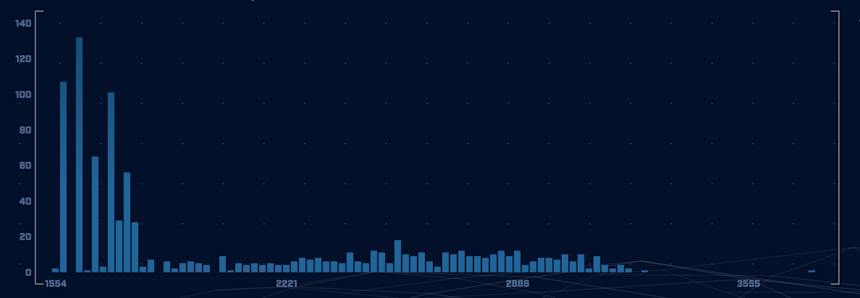
Image 1. The packet size histogram produced by Merlin C2 with values spread out over a wide range of values.
This kind of packet size histogram is unusual because it doesn’t match the patterns commonly seen in either benign traffic or C2 traffic generated by other frameworks. As shown in Image 2 below, most “normal” traffic tends to cluster around a few specific values, with noticeable gaps across the range.
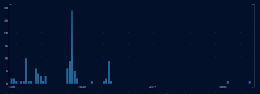
Image 2. Though “non-malicious” traffic can produce a wide variety of packet size histograms, it’s common to see it cluster around a few specific values.
In contrast, previous C2 traffic observed on the same network—primarily from Cobalt Strike—displayed a distinct “heartbeat” pattern. This pattern typically features a high concentration of connections at a specific lower-end value, often accompanied by occasional larger packet sizes that indicate data exfiltration. You can see this illustrated in Image 3 below.
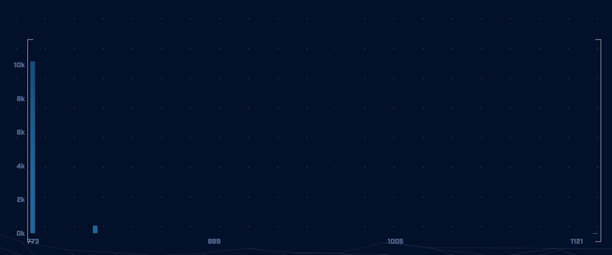
Image 3. Cobalt Strike typically produces the majority of its connections at the lowest end of the range, with a few instances of larger values.
The uniformity of Merlin’s payload jitter, combined with its lack of clustering or gaps, made it immediately suspicious.
Developing a Way to Measure Payload Jitter
While AC-Hunter performed exceptionally well in identifying the threat—ranking it at the top of our beacon threat list based on numerous factors—it didn’t explicitly quantify the unique packet size histogram pattern produced by Merlin’s payload jitter. This isn’t necessarily a gap; AC-Hunter is designed to abstract away granular details, allowing analysts to focus on what matters most: uncovering threats without getting bogged down in minutiae.
That said, I believe exploring how we might develop a measurement and accompanying tool to quantify novel threat behaviors such as payload jitter is a valuable exercise. Such an approach could help refine our ability to recognize and objectively interpret emerging threats in our environment. Additionally, having a specialized tool in our arsenal for deeper analysis may prove to be useful.
So in this article we’ll:
1. Develop a measurement to quantify payload jitter,
2. Refine the measurement by identifying gaps and addressing them,
3. Develop a Python tool that implements our measurement,
4. Analyze a collection of sample data to put our tool and measurement to the test.
By the end, we’ll hopefully have a clearer understanding of how to systematically identify and measure novel behaviors like payload jitter, enhancing our ability to stay ahead of evolving threats.
An Important Caveat
Before we dive in, I’d like to share a quick caveat: the tool we develop in this article, while having some merit and potential, is a crude approximation of a complex problem. This is not something ready for production use, nor should it be relied on for actual security coverage.
The value of this exercise is predominantly the educational journey, not the artifact-as-destination. It’s a thought experiment grounded in real-world data, designed to sharpen your critical thinking skills as a threat hunter. The value here isn’t limited to the specific threat behavior (payload jitter) we’re examining today—my aim is to illustrate the thought process behind developing tools to aid in network threat hunting in general.
That said, you’re absolutely free to fork this tool (it’s MIT-licensed) and build on it as you see fit if you’d like to adapt it for practical security purposes (you can find it here). But for today, let’s focus on the meta—the creation of tools and the thinking behind them, rather than the tool itself.
Deriving a Hypothesis
As with any good scientific endeavor, we need to start with a hypothesis. Based on my earlier assertion that the packet size histogram when payload jitter is introduced looks fundamentally different from those without it, we can begin to formulate our starting point.
A suitable hypothesis might be: “We can use a specific measurement to compare connections between different host-pairs and quantify whether or not payload jitter is being used.”
And perhaps to add a little more detail: “This specific measurement will describe how spread out and uniformly distributed a packet size histogram is, and those that are derived from connections using payload jitter will be significantly different from those that do not.”
Now this is just a starting point, and we’ll refine it further as we go, adding more detail and nuance. But for now, understanding the core of what we’re trying to achieve will help guide our process and keep us focused on the goal: developing said specific measurement.
The Core of Our Problem
Our first step in developing our measurement is to set aside all statistical concepts, proofs, and symbols. Instead, we’ll focus on breaking down the abstract ideas we’ve discussed so far into a simple, concrete, and logical proposition.
Let’s revisit our initial observation: what did I essentially assert? I claimed that when we look at histograms of packet size frequency, the one produced by Merlin—due to its payload jitter—would show a wider spread of sequential values compared to both benign traffic and non-Merlin C2 traffic.
However, when I say “spread,” it’s important to clarify that I’m not just referring to the total range (i.e., the distance between the minimum and maximum values). A histogram with one value at 100 kB and another at 10,000 kB might have a large range, but if it’s empty between those two points, it doesn’t have a large spread – see Image 4 below.
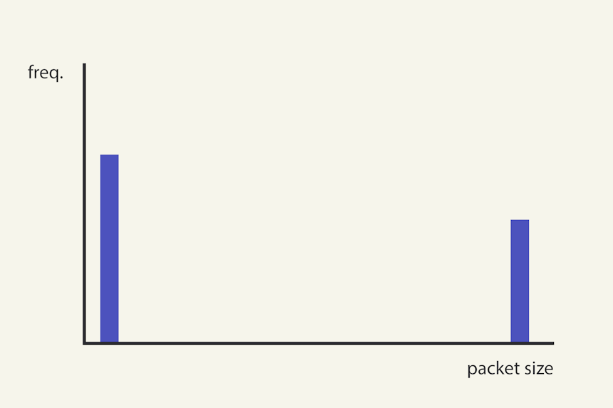
Image 4. This conceptual histogram might display a large range, but has very low spread.
What we really mean by high “spread” or “uniformly distributed spread” is that within a given range, a significant portion of the potential values (i.e., the values between the minimum and maximum) are occupied. In other words, the histogram covers a greater proportion of possible values within that range – see Image 5 below.
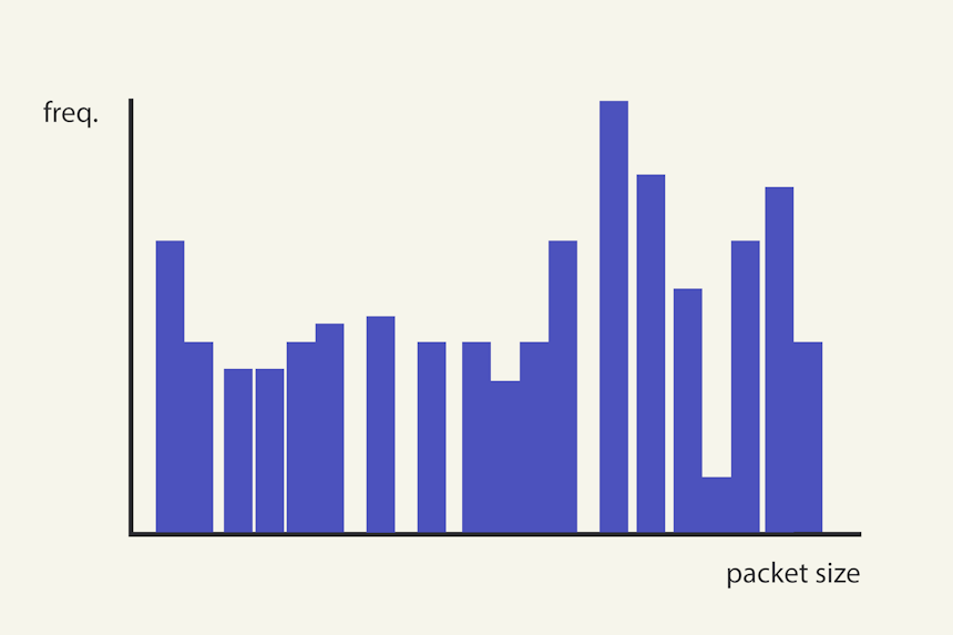
Image 5. A histogram with a high spread is one in which many of the values in the range are occupied.
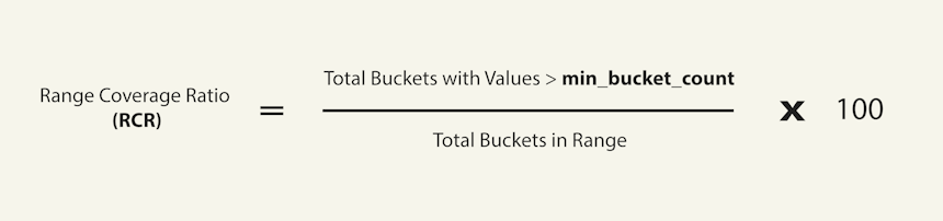
The Range Coverage Ratio (RCR)
Now, let’s take this elementary idea and express it in simple mathematical terms—and while we’re at it, let’s give it a name.
Using Image 5 above as our guide, what we’re essentially trying to quantify is how much of the total range is covered by the values in the histogram. We can express this using a straightforward ratio which we can convert to a percentage:
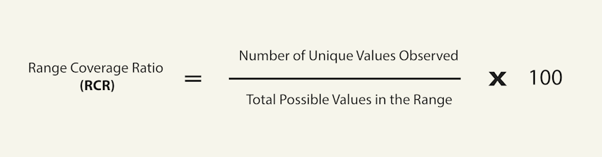
Since we’re measuring the proportion of the total range that’s covered, we’ll call this the Range Coverage Ratio (RCR). It’s perhaps not the most imaginative name, but it’s descriptive and gets the point across.
Introducing Buckets: How to Measure Coverage
Now that we’ve established our basic idea, it won’t take much reflection to realize there are several obvious blindspots and gaps we need to address. While many of these issues will only become apparent once we start testing the tool—which is inevitable—a simple mental simulation can already reveal some of our key challenges.
The first issue is foundational to any measurement: what unit should we measure in? For example, if our range is 0–1000 bytes and we want to measure coverage, we need to decide what unit to use. The obvious choice might be single bytes, but this could make our measurement overly sensitive, which can lead to over-representing randomness and thus underreporting of coverage.
To address this, a common approach in scenarios where values exhibit stochastic variation is to introduce buckets. For instance, we might create 10-byte buckets, meaning we treat everything between 1–10 bytes as equivalent (in terms of being covered or not), 11–20 bytes as equivalent, and so on, up to 991–1000 bytes.
This approach reduces the granularity of our measurement. Instead of dividing our range into 1000 single-byte units, we now have 100 ten-byte units. This helps smooth out randomness and may provide a more accurate picture. However, if our buckets are too large, we risk conflating distinct packet sizes, which could lead to overestimating the Range Coverage Ratio (RCR). As an extreme example, once our bucket size is equal to our range, it follows that only a single connection is needed to give a RCR of 100%.
So, what’s the perfect bucket size? At this stage, it’s impossible to say. Instead, we need to ensure our RCR measurement tool allows for configurable bucket sizes. This way, we can calibrate the tool once we have real data to determine the optimal bucket size that spreads the results across the full range of possible values (0% to 100%), rather than clustering them at the extremes.
One important note: this approach applies the same bucket size to all connections, regardless of their range—i.e., it’s fixed. While this ensures consistency, one could argue for relative bucket sizes (e.g., bucket sizes proportional to the range of each connection). However, that introduces additional complexity, which feels unnecessary for this thought exercise. For now, we’ll stick with absolute bucket sizes to keep things simple and focused, but do keep this in mind if you are inspired to develop this tool further.
Exactly How Uniformly Distributed Do We Mean?
We’ve established that the Range Coverage Ratio (RCR) quantifies the “uniformly distributed spread” of the packet size histogram. But now a simple question arises: how much importance do we place on uniformity?
For example, if one bucket has 10 connections and another has 100 connections, should we consider that variation in our measurement? Probably not, because we don’t care about the weight of individual buckets—we only care about whether they’re filled or not – see Image 6 below.
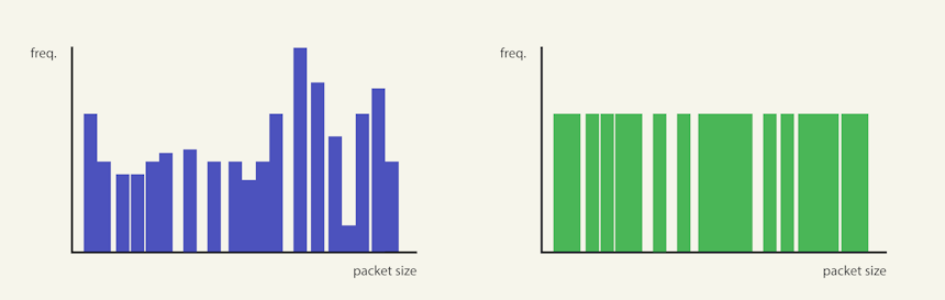
Image 6. From the perspective of RCR these two histograms can essentially be treated the same – we are not interested in uniformity regarding height (frequency), but rather regarding spread (packet size).
That said, if a bucket has just 1 connection, should it really be given the same weight as a bucket with 100 connections? That doesn’t seem right either. A single connection might be due to an error or random variation (i.e., an anomaly), whereas a bucket with 100 connections clearly indicates that the packet size was an intentional outcome.
So for now we need to introduce at least one additional constraint in our application logic: a minimum number of connections required for a bucket to be considered filled. For simplicity, we’ll once again use a fixed value, however, if you decide to refine this tool further, you could certainly explore adding a relative component to make the threshold more dynamic.
The Classic Problem of Outliers
It probably comes as no surprise that we need to account for potential outliers in our dataset. This is especially true for network connections, particularly when using Zeek, where egress data is defined per connection. Meaning that if a connection fails to disconnect and persists longer than intended (a surprisingly common occurrence), it could significantly skew our results.
Let’s consider a simple example. Suppose we have a range of 0–100 bytes, 10-byte buckets, and a minimum bucket size of 2 connections. We obtain the following results (Image 7 below), with a RCR of 100%.
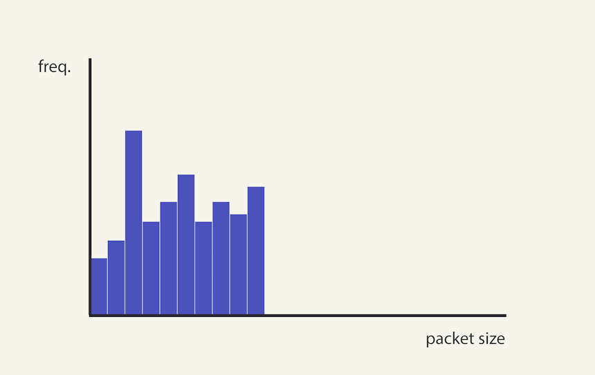
Image 7. Since every possible bucket between the minimum and maximum are occupied, the connection’s RCR will be 100%.
Now, imagine a scenario where a few cycles of this connection fail to disconnect, producing 2 connections in the 190–200 byte range (see Image 8 below). This faulty behavior shifts our RCR from approximately 100% to 55 %. Clearly, we need a way to account for such outliers.
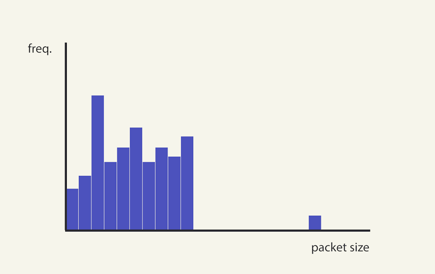
Image 8. The introduction of an outlier can dramatically reduce the RCR value.
However, detecting outliers isn’t always straightforward. While it’s obvious that we need to remove them, determining what constitutes an outlier can be tricky. To illustrate the complexities, we’ll start by using the Z-score as the foundation for our outlier detection logic, which is a common and widely used metric for outlier detection.
The Z-score is defined as:
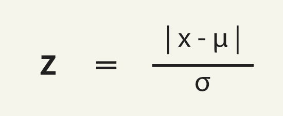
Where:
- x is the value of the bucket we’re evaluating,
- μ is the mean of the dataset, and
- σ is the standard deviation.
In simpler terms, the Z-score measures how far a data point is from the mean, relative to the standard deviation. If this value ends up being greater than a specific value (the default is 3), we consider the data point an outlier. Essentially, we’re asking, “How far is this data point from the rest of the dataset?”
While this sole focus on distance makes sense in many situations, it has a limitation when applied to network communication and packet sizes: it’s common to have clusters of data points that are far apart. For example, in C2 communication, we often see two distinct clusters: one at the lower end (representing heartbeat requests from the agent) and another at the higher end (representing data transfers when commands are issued) – see Image 9 below.
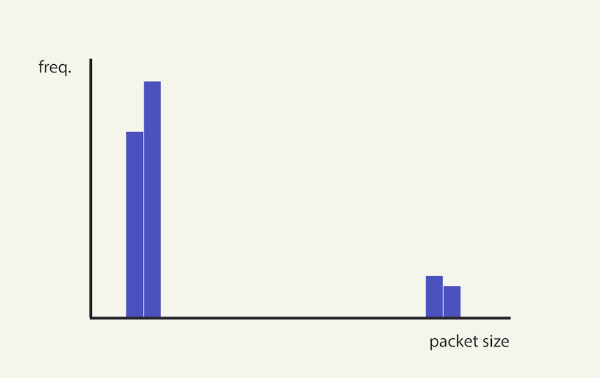
Image 9. It’s common to see a C2 framework to produce a packet size histogram with 2 distinct clusters, with many events at the lower end (heartbeats), and a few at the higher end (data transfer).
So if we were to use the Z-score alone, we’d likely misclassify the higher cluster as an outlier, leading to their incorrect removal and a gross overestimation of the RCR. To address this, we’ll enhance our outlier detection logic by not only calculating the Z-score, but thereafter also considering the size of the cluster.
Following Z-score classification, we’ll scrutinize potential outliers further by evaluating:
- Cluster Width: The maximum width (in bytes) for points to be considered part of the same cluster, and
- Minimum Cluster Size: The minimum number of points required to be considered a valid cluster.
This two-step approach ensures that we don’t mistakenly discard meaningful clusters while still filtering out true outliers.
Blindspots… Blindspots Everywhere!
At this point, there are still many potential blindspots we could address in our calculation. For example:
- How many connections are needed in a sample to be considered valid?
- Is it appropriate to compare ranges of 10 bytes against ranges of 10,000 bytes?
- How can we deal with perpetual vs beaconed connections?
- Etc.
These questions, along with many others, are valid considerations for further refinement. However, for the purposes of our current journey, I believe now is the perfect time to summarize our definition and move on to the actual implementation and measurements.
Putting It All Together
Finally, let’s synthesize our current working definition of the Range Coverage Ratio (RCR):
Where:
- bucket_size: The size of each bucket (in bytes),
- min_bucket_count: The minimum number of connections required in a bucket for it to be considered filled,
- z_score: The Z-score threshold used to initially identify potential outliers, and
- cluster_width and min_cluster_size: Parameters used to determine whether a potential outlier is truly an outlier or part of a separate cluster.
Now that we’ve derived the logical core of measurement we can implement a Python script to make use of it.
A Python Tool to Implement Our Measurement
The complete implementation can be found in the GitHub repository here. Detailed instructions are provided in the accompanying README, but here’s a quick overview:
- Input Data: Place all the Zeek logs you’d like to analyze in the ./input directory.
- Configuration: Configure the specific IPs to analyze, along with operational parameters like bucket_size, in the config.json file.
- Execution: Run the script from the root directory using python main.py.
- Results: The output will be saved as results.html in the root directory.
To help you get started, I’ve included example logs with sensible default configuration values already set. The provided dataset contains 7 Zeek logs, analyzing 14 IP addresses in total. These include:
- 3 connections to a Merlin C2 server with payload jitter,
- 5 connections to a Cobalt Strike C2 server without payload jitter, and
- 6 connections to non-malicious background services, including Bacom, Canonical, Akamai, and Microsoft.
Let’s jump into our results.
Results
Before diving into the results, let’s address an important caveat: our sample size is incredibly small, so we won’t be measuring p-values or statistical significance. Such analysis is beyond the scope of this article. While we can explore these results for insights, no conclusions can be drawn with certainty.
Now, let’s take a look at the main results in Table 1 below.
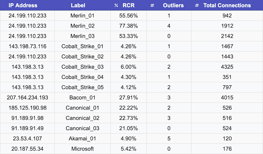
Table 1. RCR results for our 14 analyzed connections.
As we suspected, connections between Merlin agent-server pairs with payload jitter produced the highest RCR values, ranging from 53.33% to 77.38%, with a mean of 62.90%.
Non-malicious traffic showed greater variance, with RCR values ranging from 4.90% to 27.91% and a mean of 17.37%. Interestingly, traffic produced by Cobalt Strike, which did not use payload jitter, had an RCR range of 4.14% to 6.00%, with a mean of 4.59%.
Our script also generates detailed output for each analyzed connection, including two graphs: one showing the range before outlier removal and another after. These visuals are included to help you calibrate the operational parameters related to outlier removal, ensuring they function as intended.
Below we can see single representative results for Merlin C2 with payload jitter (Image 10), Cobalt Strike C2 without payload jitter (Image 11), and Non-malicious traffic (Image 12).
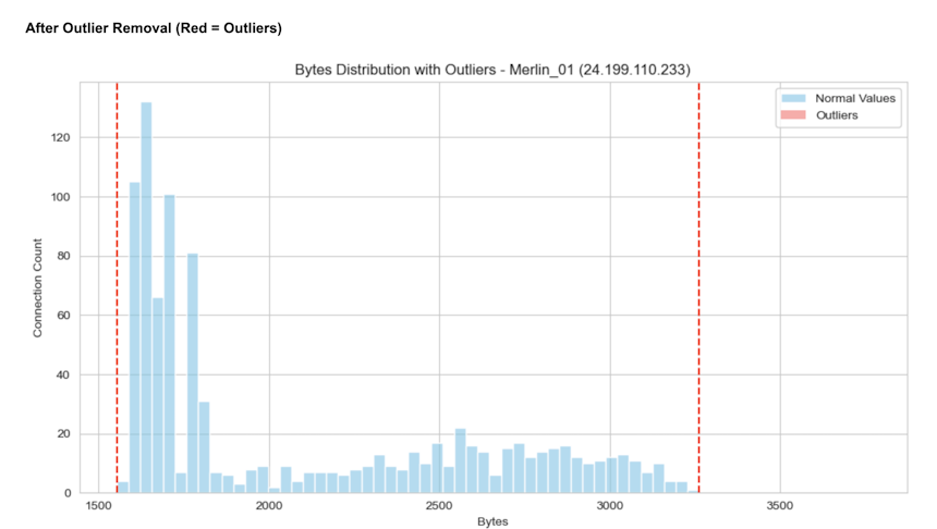
Image 10. Visual representation of RCR for Merlin_01.
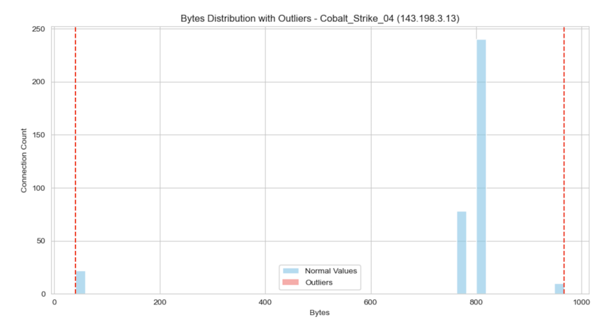
Image 11. Visual representation of RCR for Cobalt_Strike_04.
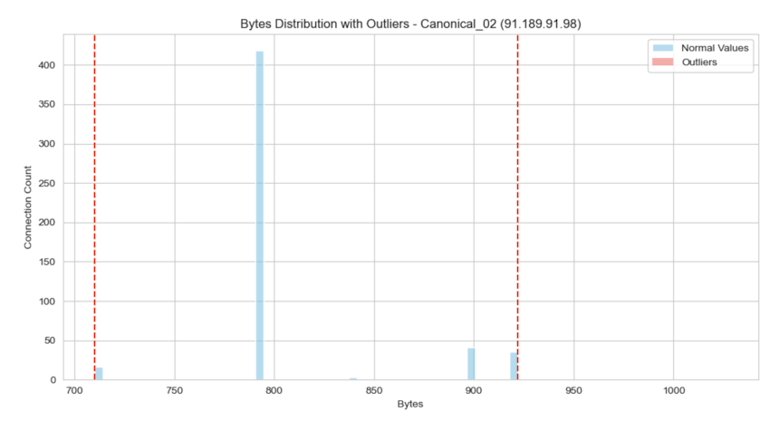
Image 12. Visual representation of RCR for Canonical_02.
Discussion
Our exploration into measuring data jitter using the Range Coverage Ratio (RCR) has yielded valuable insights, both in terms of the specific behavior of payload jitter and the broader process of developing tools to detect novel threat behaviors. The results of our analysis support our initial hypothesis: payload jitter, as implemented by Merlin C2, produces packet size histograms with higher RCR values compared to both benign traffic and non-jittered C2 traffic like Cobalt Strike.
The development of the RCR measurement and the accompanying Python tool represents a critical step in transforming a subjective observation into an objective, repeatable process. By breaking down the problem into logical components—defining the RCR, addressing outliers, and refining parameters like bucket size and minimum cluster size—we’ve created a framework that can be adapted and expanded upon. While the tool in its current form is experimental and not production-ready, it serves as a foundation for further refinement and exploration.
Connecting the Dots
This exercise underscores the importance of post-incident analysis as a learning opportunity. Just as an immune system adapts to new threats by analyzing their unique characteristics, we’ve dissected the “genome” of payload jitter to better understand its patterns. By doing so, we’ve not only improved our ability to detect similar threats in the future but also demonstrated the value of systematic, hypothesis-driven approaches in threat hunting.
The process of developing the RCR measurement also highlights the iterative nature of tool creation. From identifying blindspots in our initial assumptions to refining outlier detection logic, each step brought us closer to a more robust and reliable measurement.
Next Steps
For readers interested in building on this work, there are several avenues for further exploration:
- Larger Datasets and Statistical Validation: While our initial results are promising, they are based on a small sample size. Expanding the dataset to include more diverse traffic patterns—both malicious and benign—would allow for more rigorous statistical validation and help refine the RCR thresholds for accurate detection.
- Dynamic Parameter Calibration: The current implementation uses fixed parameters like bucket size and minimum cluster count. Developing a method to dynamically calibrate these parameters based on the range and distribution of the data could improve the tool’s adaptability and accuracy.
- Integration with Existing Tools: Integrating the RCR measurement into existing network monitoring or threat-hunting platforms could enhance their ability to detect payload jitter and similar behaviors. This would require further optimization to ensure the tool performs efficiently at scale.
- Processing Entire conn.log Files for Outlier Detection: In this study, we targeted specific IPs in a Zeek log, meaning we already had to suspect those IPs to analyze them. However, the tool could be significantly more useful if it were adapted to process an entire conn.log file, analyzing all IPs to identify outliers that meet a specific RCR threshold. This would transform the tool from a targeted analysis utility into a broader detection mechanism, capable of flagging potentially malicious behavior across an entire network without prior suspicion. Such an approach would align more closely with real-world threat-hunting scenarios, where adversaries may not yet be on the radar.
Final Thoughts
This journey from discovery to measurement has been a great example of how combining intuition with systematic analysis can lead to meaningful insights. By turning an abstract observation—like the unusual packet size patterns caused by payload jitter—into a concrete tool, we’ve not only confirmed our initial hunch but also created a foundation for detecting similar threats in the future. While the RCR measurement is just one piece of the puzzle, it shows how even subtle anomalies can be measured and used to strengthen our defenses.
The threat landscape is always changing, and so are the tools and techniques we use to defend against it. Staying curious, asking questions, and iterating on ideas—like we did here—are key to keeping up. Whether you decide to refine this tool, adapt it to other behaviors, or just use it as a starting point for your own experiments, the process itself is what matters most. At the end of the day, it;s not just about the tool—it’s about the mindset.
Live Long and Prosper,
Faan

Faan is a security researcher specializing in detecting post-exploitation malware, with a focus on network communication. He likes exploring threat hunting via a purple team approach by simulating adversarial activity to develop novel threat hunting detections. He also loves building covert channels and unusual malware communication methods, creating threat emulation tools that inform new detection vectors.